After discussing my first project with my tutor, we decided to make some changes to make it flow more as a project.
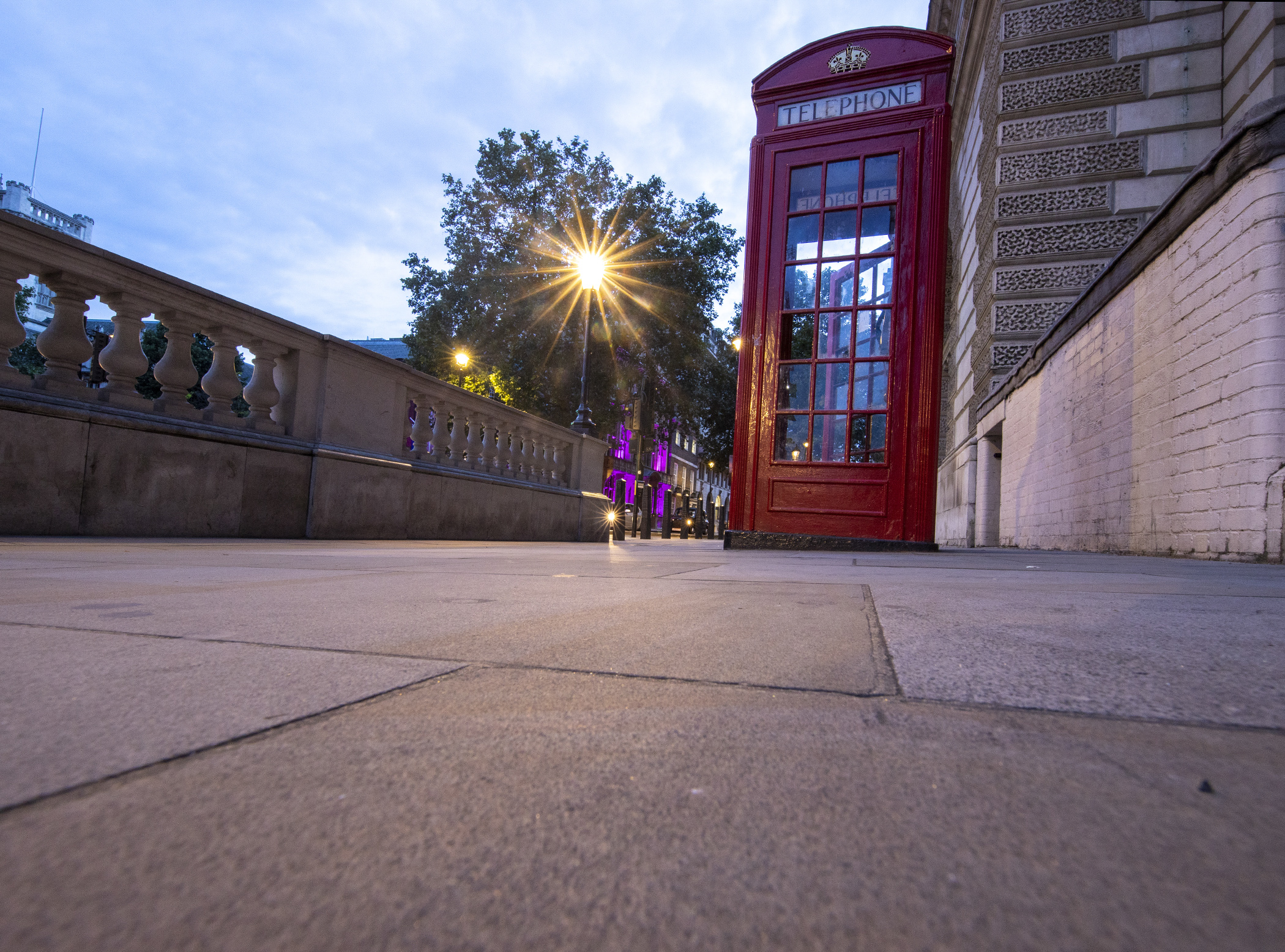
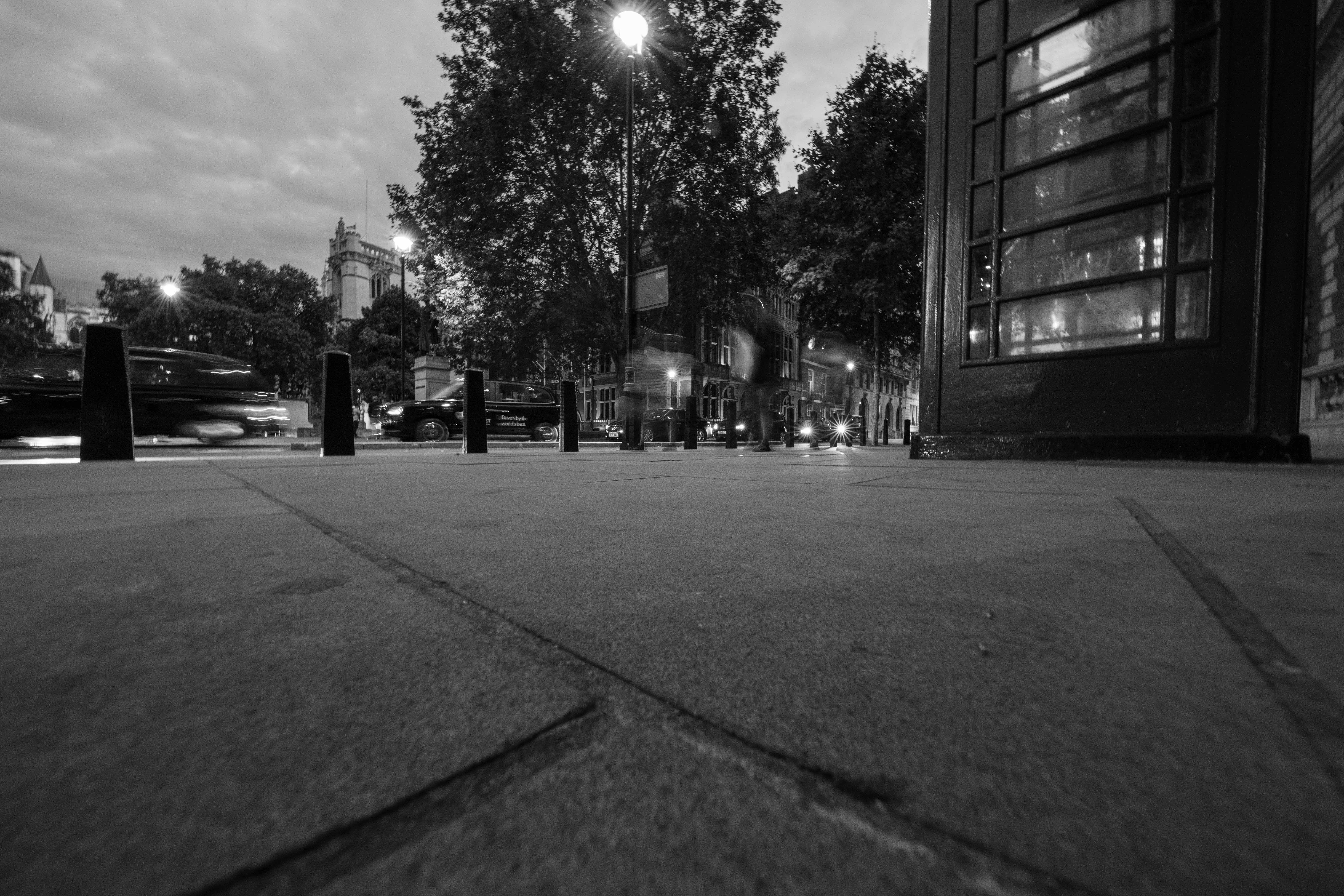
On 23rd June 2016, the Nation finally settled the question that had been rumbling under the surface of British politics for generations. Should we remain in the European Union or leave and end the 40 year relationship to go it alone?
Of the 52% of the public who voted to leave the EU many thought it would be concluded by now. Unfortunately this was not the case, three years and Three Prime Ministers later, deep into the departure process, we’re still here, stuck in the quagmire of bureaucracy, still weighing up the pros and cons of Brexit and what that means for Britain.
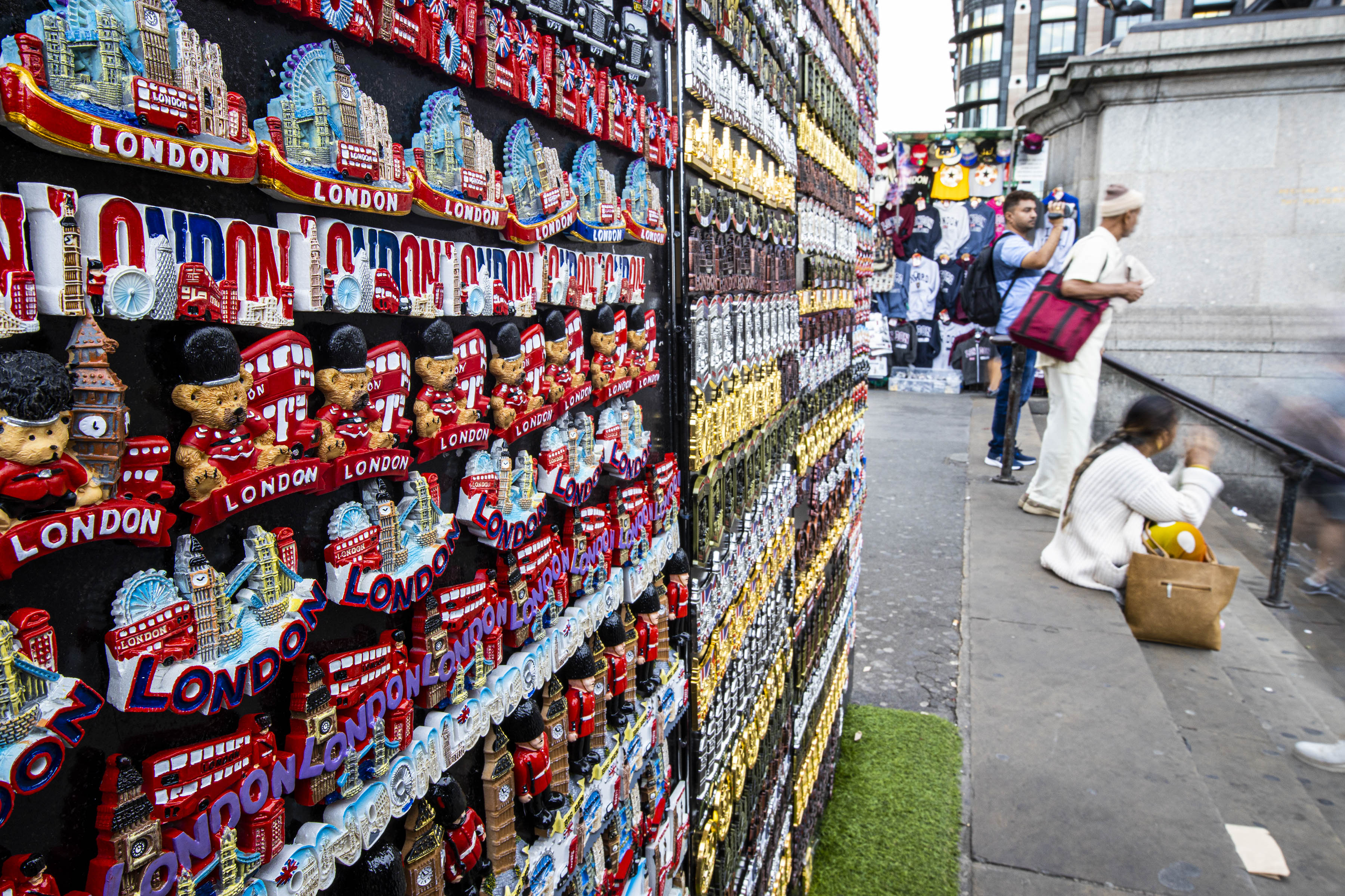
There are many pros and cons to both sides, Too many to comprehensively cover here. From Sovereignty to trade deals, immigration to investment, the debate rages on.
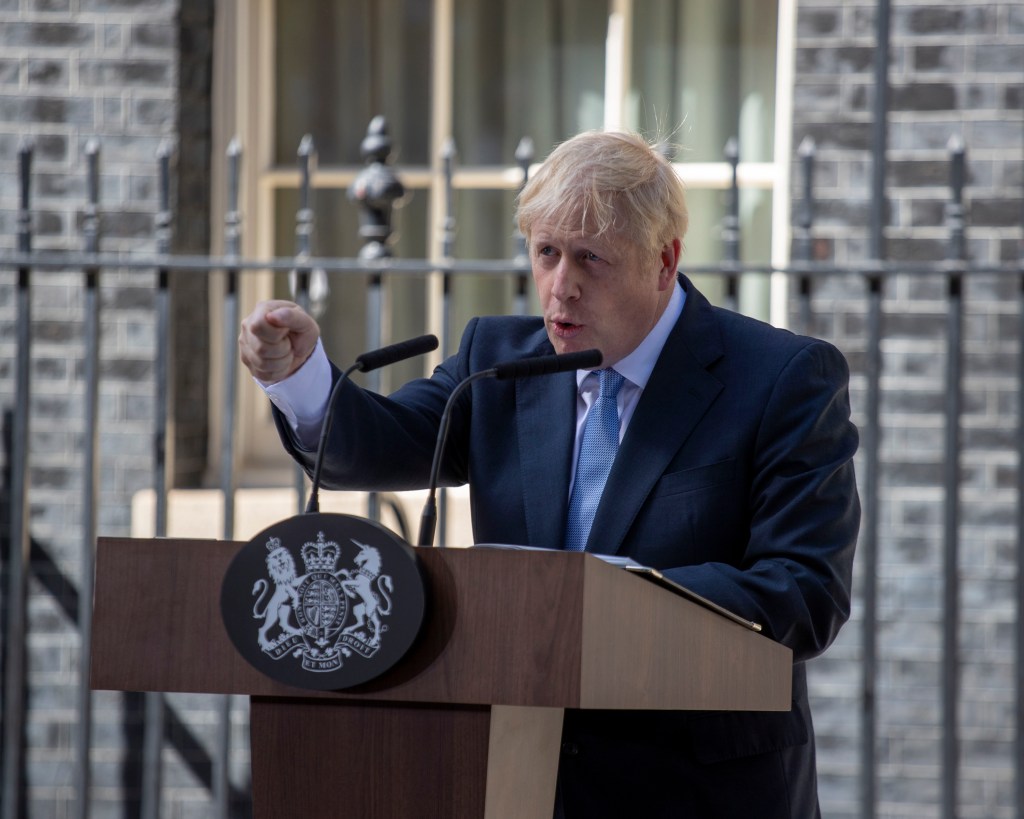
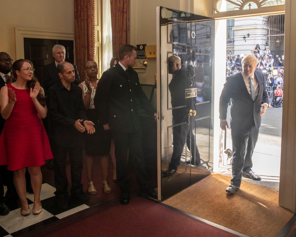
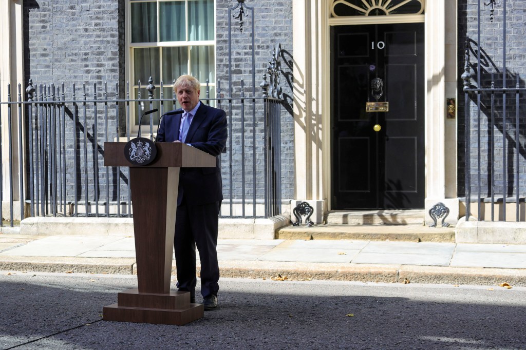
In this set of images I wanted to portray the embodiment of each side of the debate. On one side we have Boris Johnson, at the forefront of the Brexit campaign, then Home Secretary and now Prime Minister. His name is synonymous with Brexit and now he leads the country towards the latest deadline of the 31st of October. Here is a man who feels he was born to be the Prime minister, a man that now leads the UK from the EU, he has worked himself to the highest position on the inside of government to see that happen. He is an unmistakeable character that fills a room with his presence and charms them with his razor wit and undoubtable sense of humour. The lines are blurred between where the persona ends and the person starts with Boris Johnson, he has been building his public image for a long time.
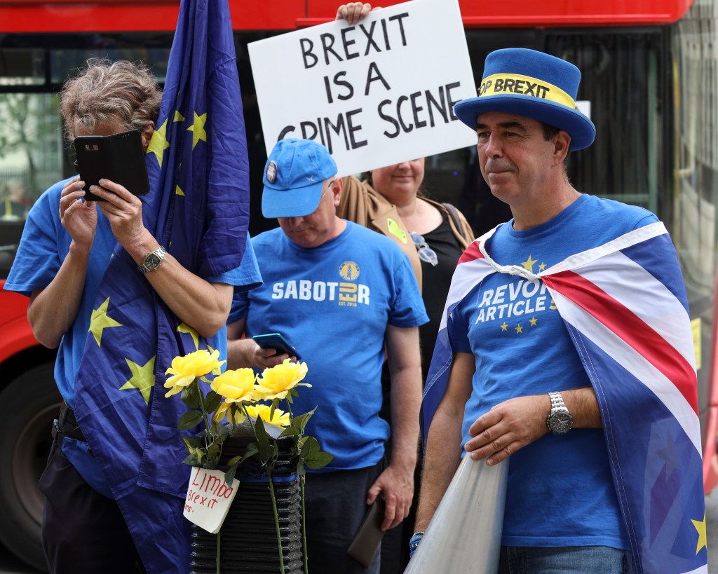
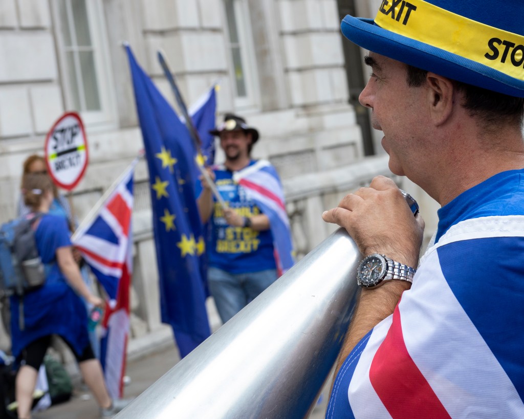
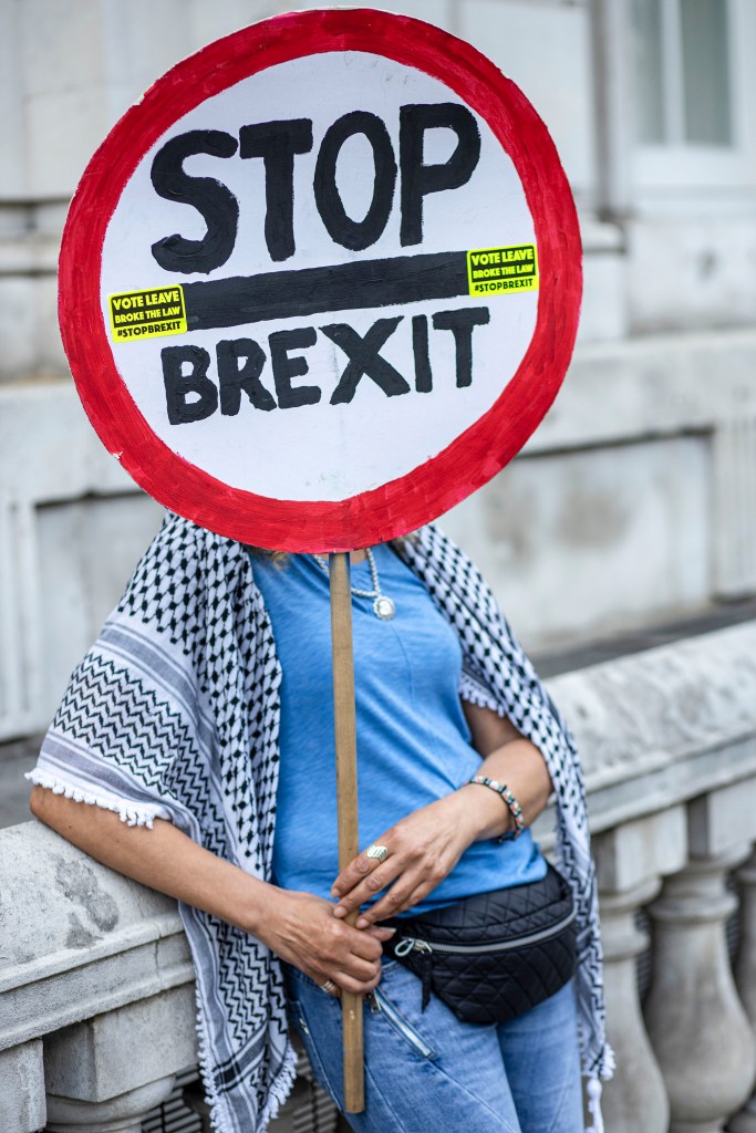
On the other side you have Steven Bray, better known as Stop Brexit Man. Since September 2017 Steve Bray has braved all weathers to mount his ‘Stand of Defiance European Movement’ (SODEM) Protest outside parliament and the cabinet office, to keep the remain option top of everyone’s mind. Many MP’s, peers, activists and members of the public have said how vital the SODEM protest is to the Remain cause. He is loud, colourful, with a wry sense of humour. Steve’s alter ego is easier to define, his persona has to be more hard hitting, he is literally on the outside of the debate, reacting in the only way he knows how. Steve has been a constant thorn in the side of any of the establishment trying to cut remain out of the public arena.
Each man, polar opposites in background and philosophies, one an Eton educated career politician, the other a small business man from Wales. Despite their differences there are many similarities between the two men, they are both white, middle aged from the ‘boomer’ generation. both men striving for something they passionately believe in, maybe In differing circumstances they could even be friends but for now they will stay two sides of the same coin.
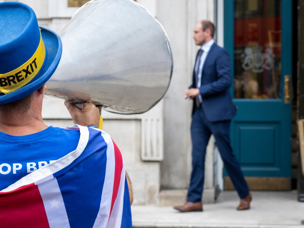
Steven Bray, Stop Brexit Man, shouts at people leaving the Cabinet Office, Whitehall 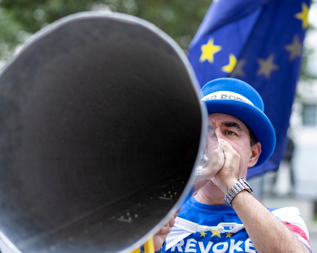
Steven Bray, Stop Brexit Man, shouts at people leaving the Cabinet Office, Whitehall 
Steven Bray, Stop Brexit Man, shouts at people leaving the Cabinet Office, Whitehall 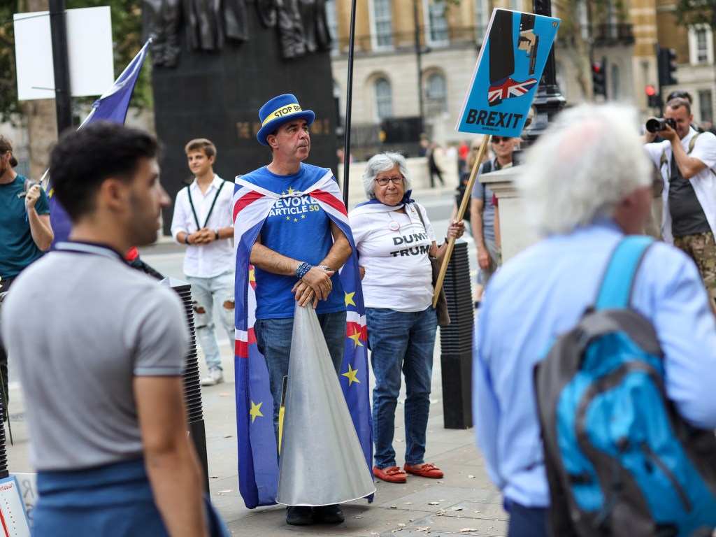
Steven Bray, Stop Brexit Man, shouts at people leaving the Cabinet Office, Whitehall 
Steven Bray, Stop Brexit Man, shouts at people leaving the Cabinet Office, Whitehall

Prime Minister Boris Johnson Arrives at Number 10 Downing Street 
Prime Minister Boris Johnson Arrives at Number 10 Downing Street 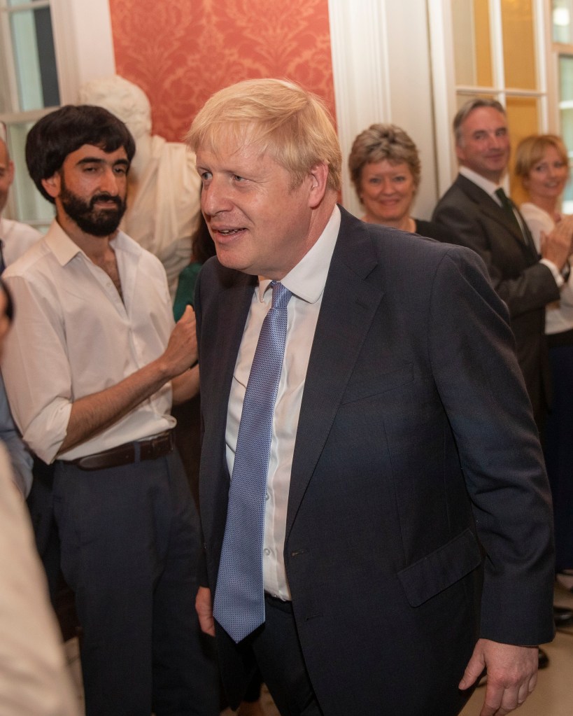
Prime Minister Boris Johnson Arrives at Number 10 Downing Street 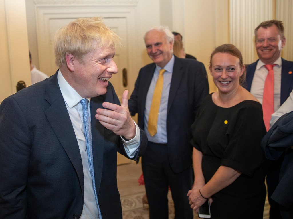
Prime Minister Boris Johnson Arrives at Number 10 Downing Street 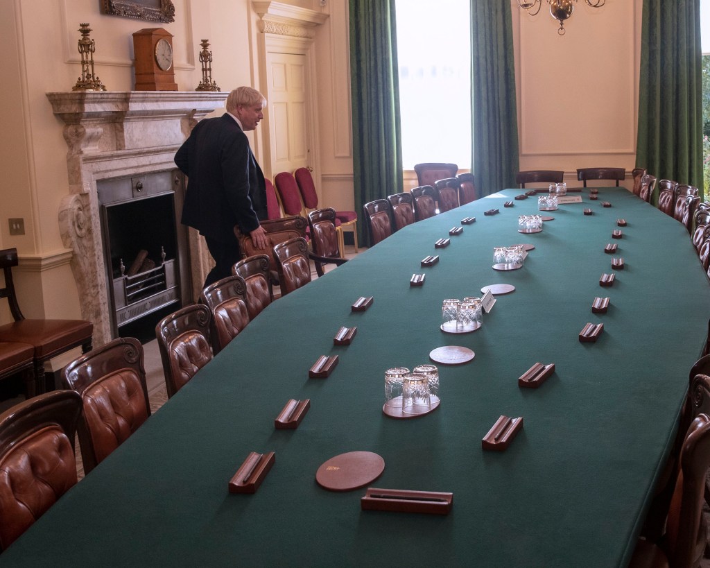
Prime Minister Boris Johnson Arrives at Number 10 Downing Street